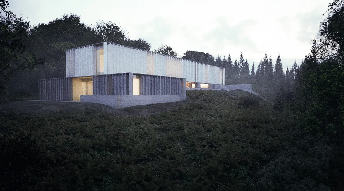
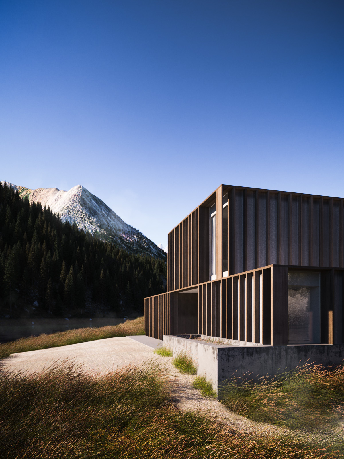
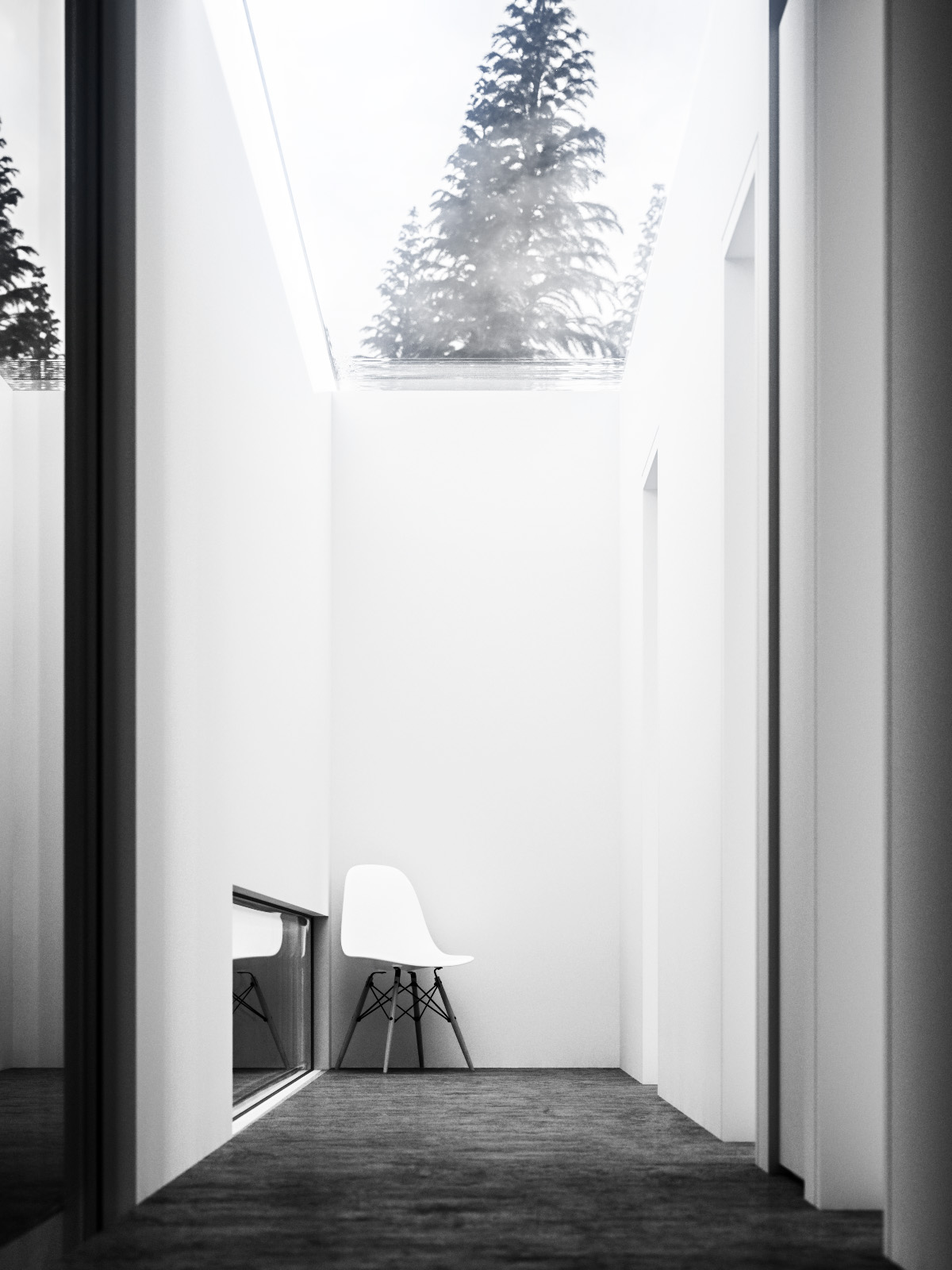
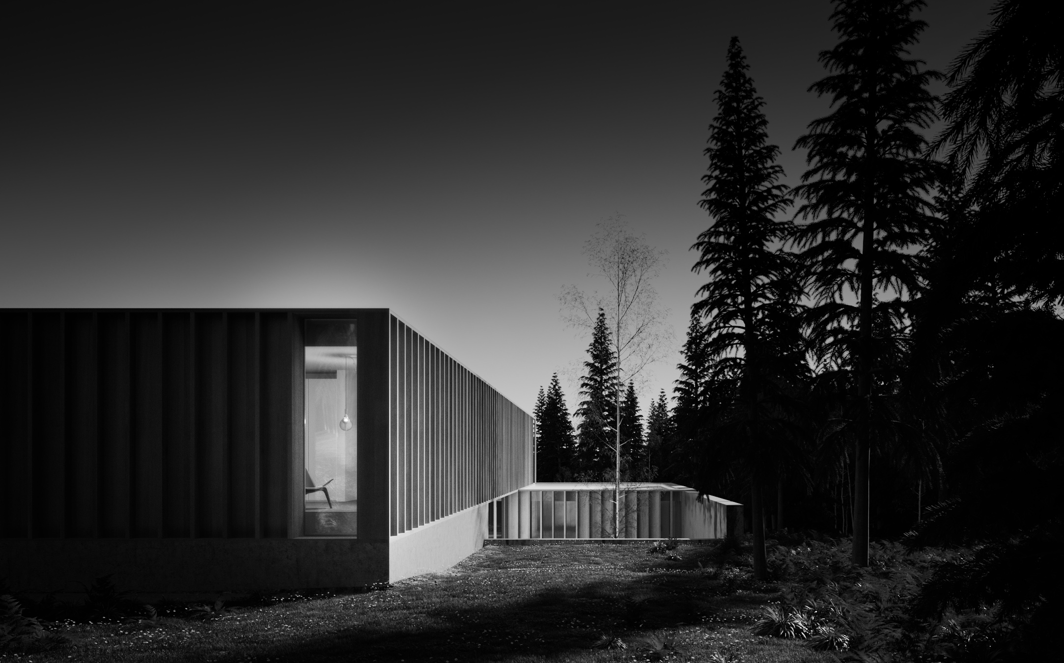
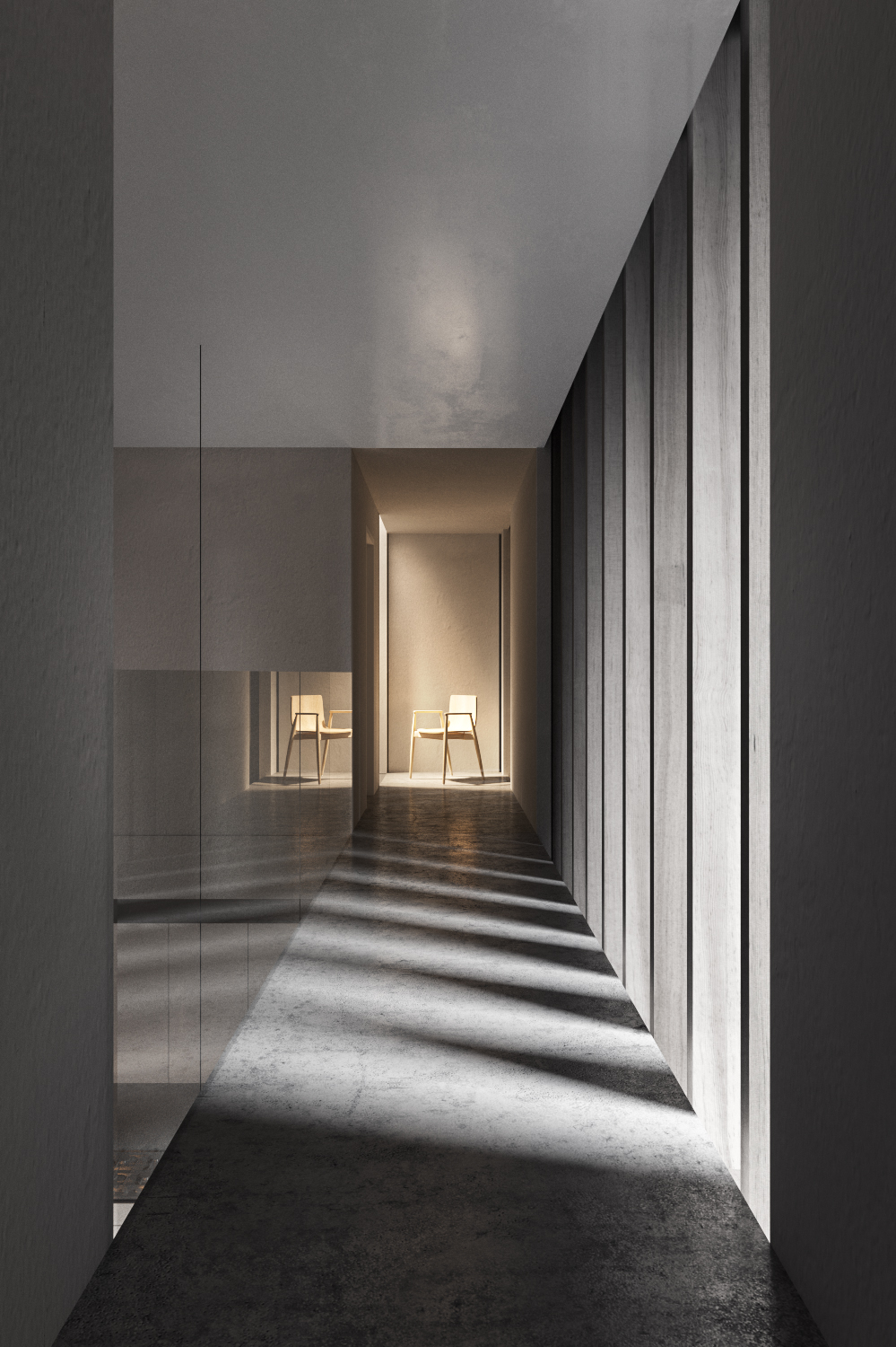
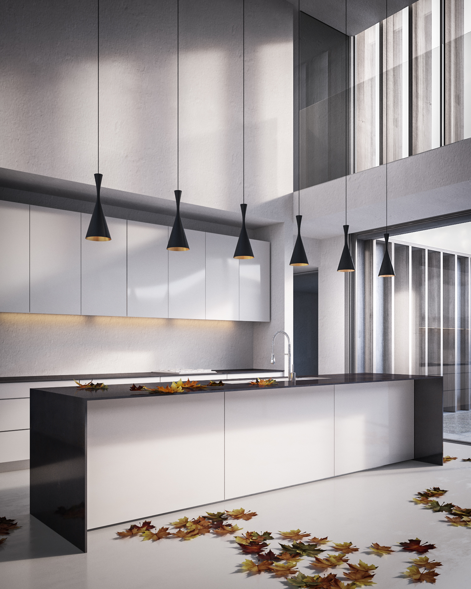
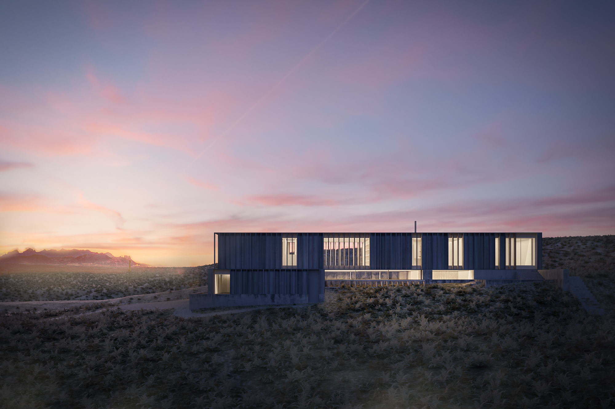
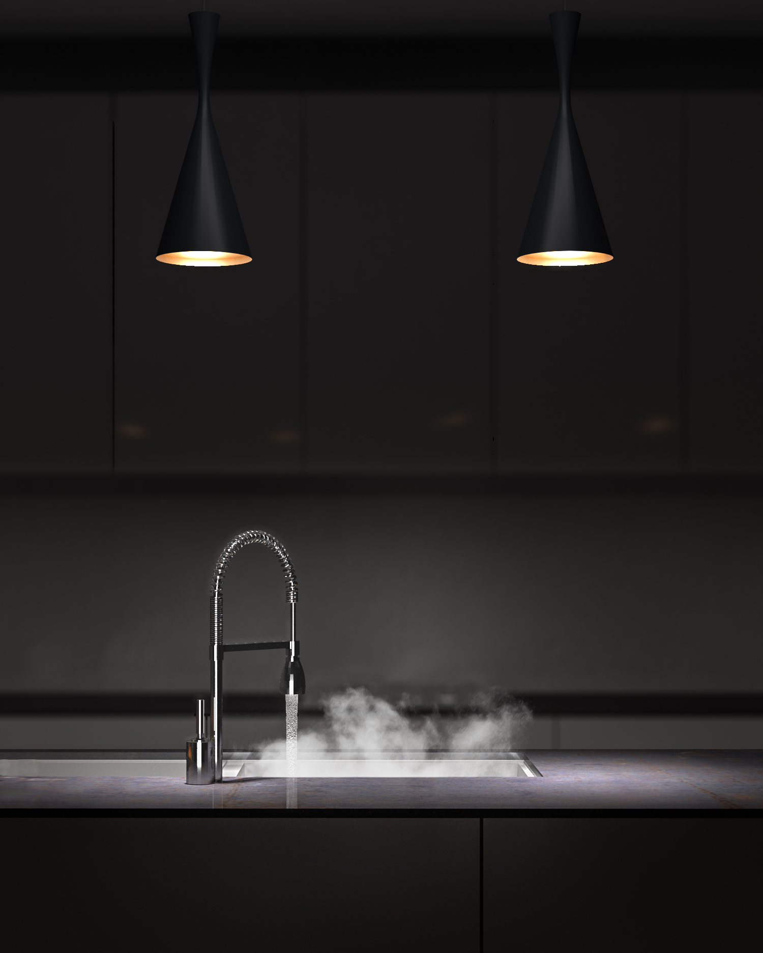
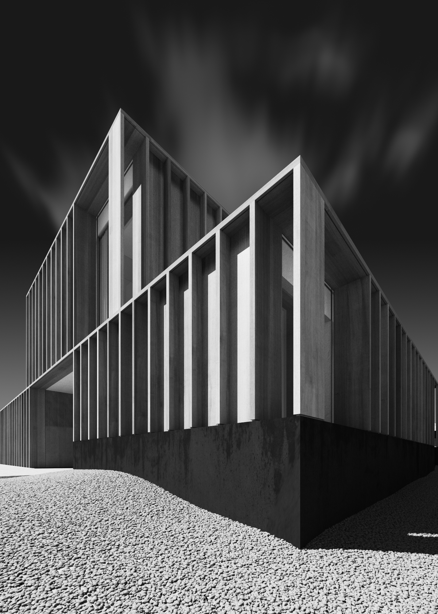
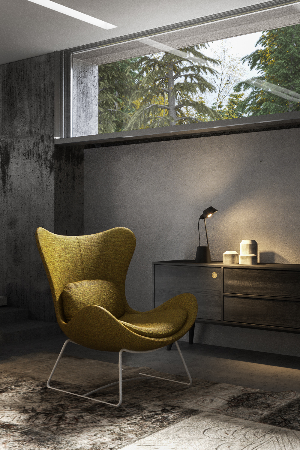
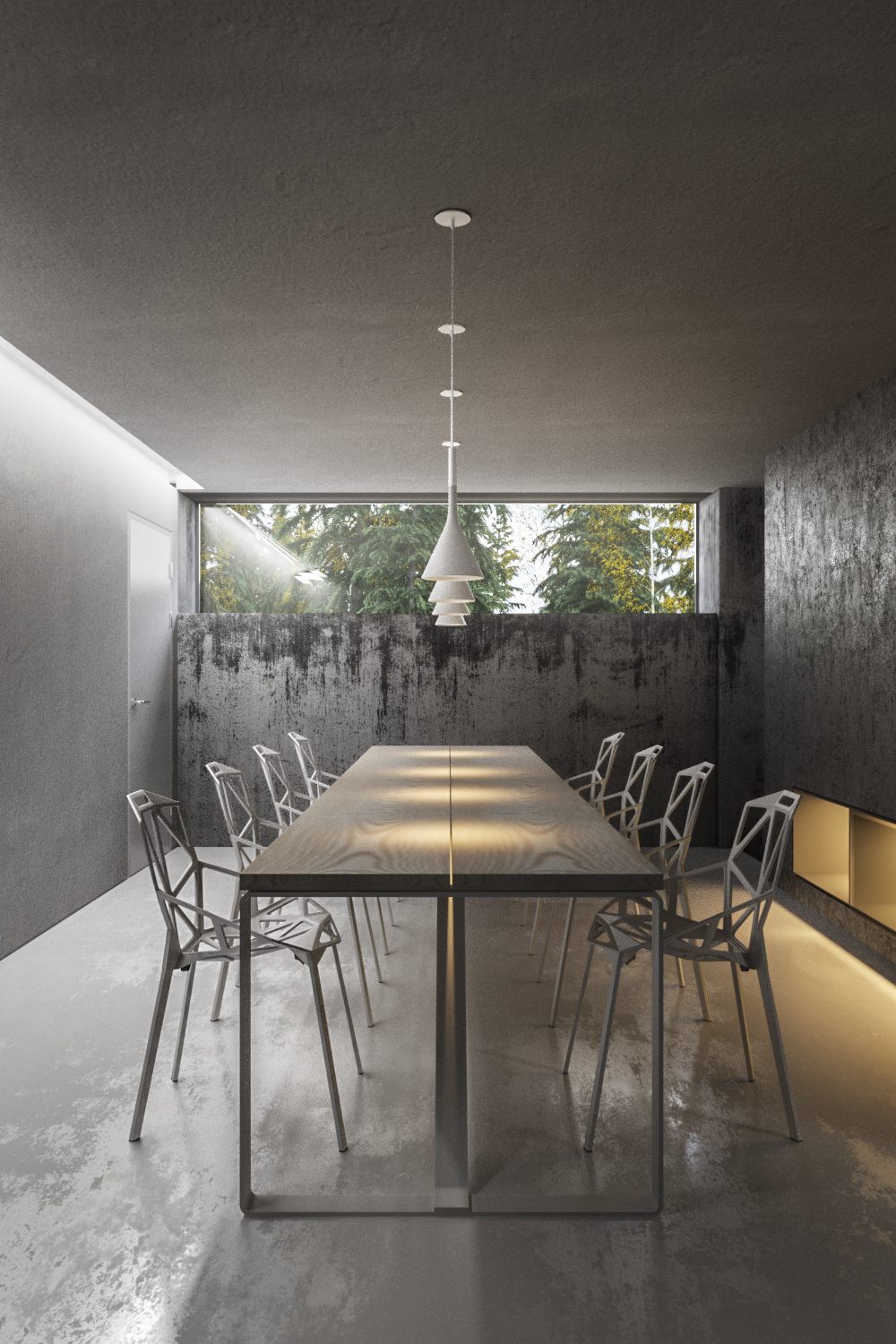
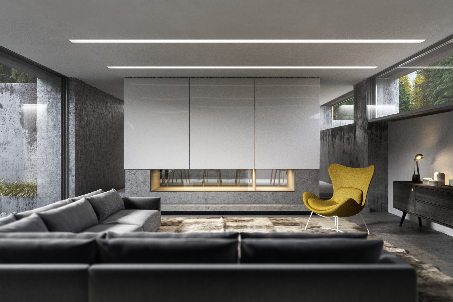
This is the full gallery of a quite amazing amount of work accomplished in one week by 12 students. You can find out more or get in touch with the artists from the links provided, or feel free to leave comments below.
If you are interested in attending one of my lighting masterclasses, there is a strong possibility i'll do another one next year with SoA. Keep an eye on the State of Art Academy homepage for announcements.
Alessandro Consonni - http://www.behance.net/ac3dartist
Alessandro concentrated on interiors, and went for a very stylish minimal look. Rendered in Corona and with Corona environment fog which worked out really well. Click the thumbs for lightbox mode.
Alessandro Massi Mauri - http://www.lissoniassociati.com/
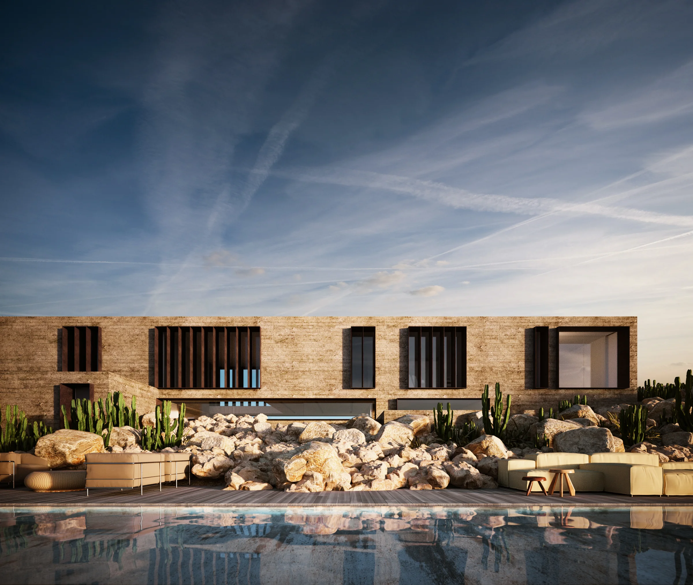
Alessandro Massi Mauri started with some basic changes to the architecture (black timber) and made a desert landscape which worked surprisingly well. An alternative, Rick Joy inspired version of the house completes a great set of renders.
Darwin Ceballos - https://www.behance.net/Darwin_Ceballos
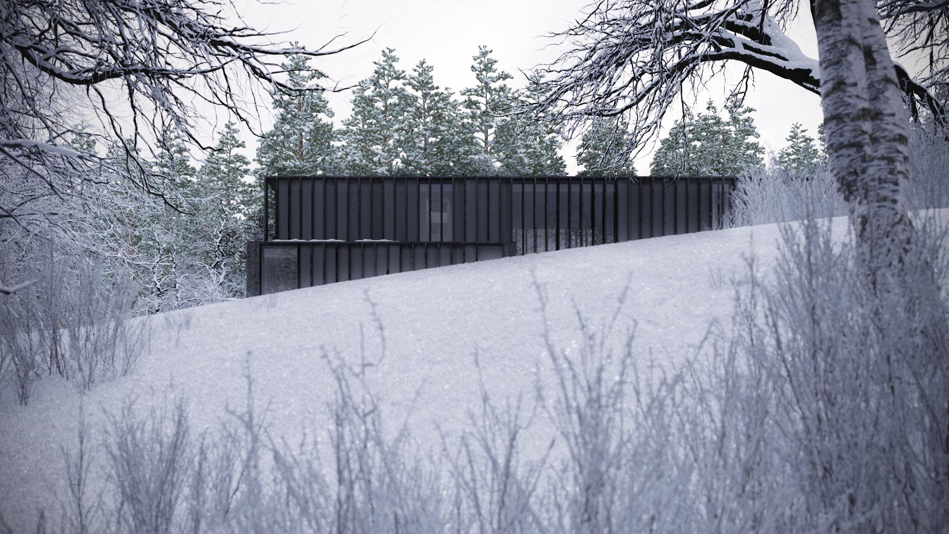
Darwin went for a Nordic winter theme and found some very pleasing lighting set-ups in which the architecture looks right at home.
George Nijland - http://georgenijland.nl/
A very strong set of images from George, who chose to concentrate on landscaping and exterior views. I especially like the subtle and carefully managed colours of the green grasses and the blues in the sky. Not an easy thing to do well.
Giuliano Sabadin - http://www.giulianosabadin.blogspot.com/
Lots of images with potential, but the wintery scene is my favourite, plus he seemed to knock it together in no time at all!
Jeroen Henning - http://www.ciiid.nl/
Jeroen tried a bit of everything and as a result seemed to get a lot out of the week. Corona AND Vray. Solid interiors and ambitious, expansive exteriors. I really hope to see the valley shot rendered higher res and with lots of detail added.
Matthias Arndt - http://www.lichtecht.de/
Some nice moves in changing the architecture set the tone for Matthias' images. Clean compositions and balanced lighting. I especially liked the buildings new relationship to the landscape.
Oguz Kalafat - https://www.behance.net/oguzkalafat
Oguz used the classic Julius Shulman LA image as inspiration and amended the architecture to suit his purpose. A strong set of well balanced moonlit images.
Paolo Faleschini - http://www.paolofaleschini.com/
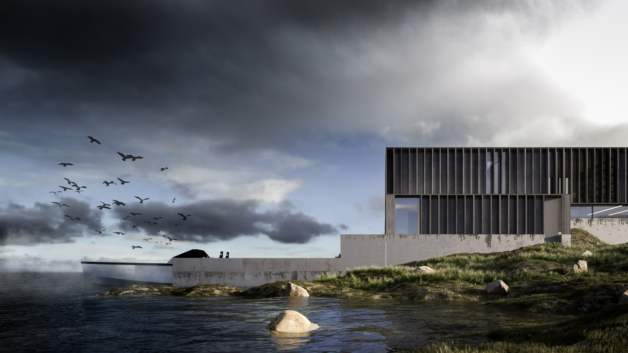
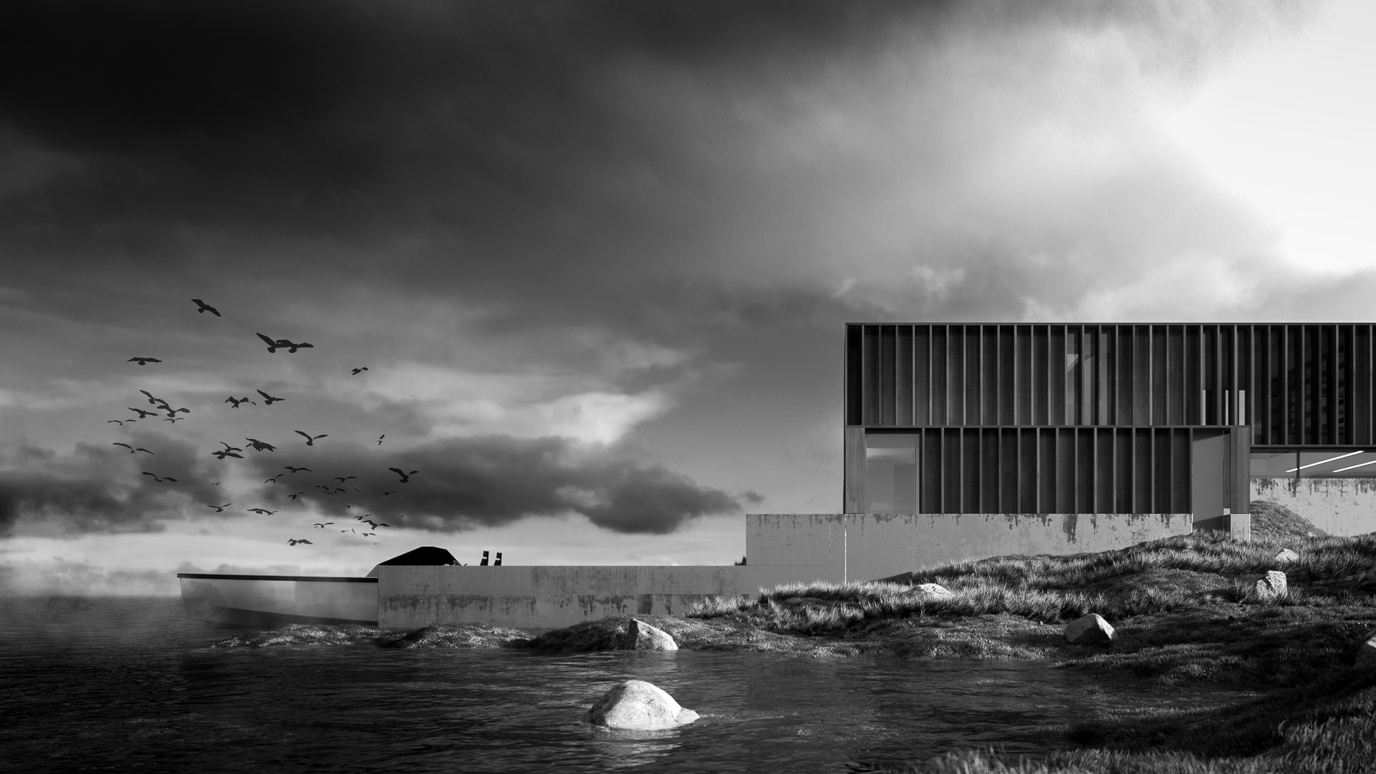
Paulo took my suggestion of making B&W images, and did it really really well. Strong compositions, great use of light. As Gianpiero said to me later, they sum up the product of a lighting masterclass perfectly.
Robert Dukes - http://www.robertdukes.com/
Robert took the existing landscape and developed it even further, and modified the architecture quite a bit too. A great selection of compositions, and lots of good experimentation with different HDR skies as well.
Sandra Ferminan - http://www.ferminnan.com/
Sandra matched the atmosphere perfectly of the inspiration images she had chosen. Strong compositions and really beautiful colours, especially in the tree shot.
Walter Pegolo - http://www.oecusdesign.it/
Another mix of Corona & Vray with a strong emphasis on interiors. Walter also tried his hand at an exterior which resulted in a nice soft dusk image.


